A moment of joy with CSS grid
I was recently implementing a seemingly simple layout that could be boiled down to the following:
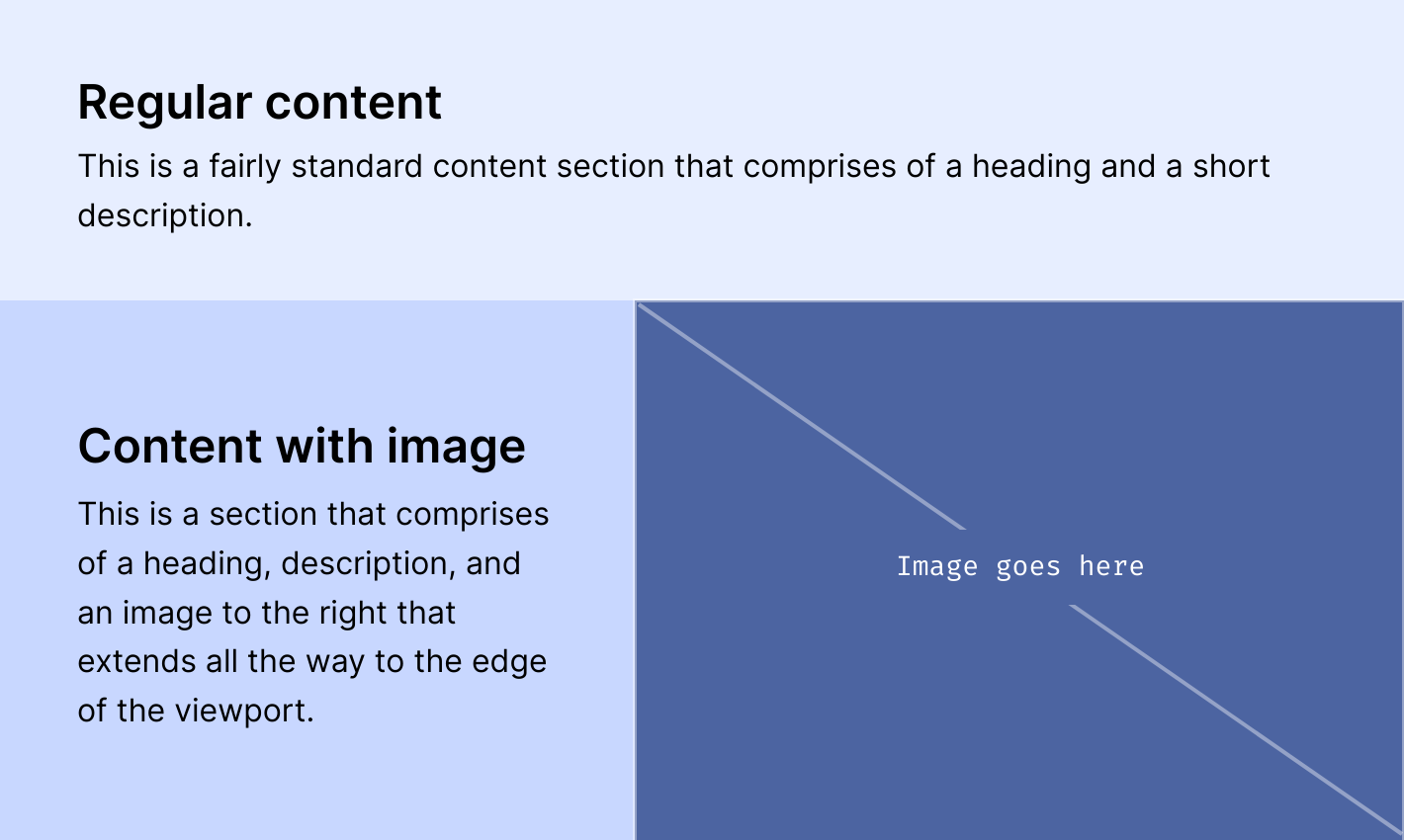
Some content then some more content with an image to the right. Seems pretty standard. The catch here, though, is that the image must extend all the way to the edge of the viewport while the text must be contained in a center-aligned container with a max-width. Most of the site’s other content must adhere to this invisible container as well.
The markup for this looked something like this:
<div class="image-section">
  <div class="image-section__content">
    <h2 class="image-section__heading">...</h2>
    <p class="image-section__paragraph">...</p>
  </div><!-- .image-section__content -->

  <img class="image-section__image" src="..." alt="..." />
</div><!-- .image-section -->
At this point, I was already using .container in multiple sections, and it was styled like:
.container {
  max-width: var(--container-width);
  padding-inline: var(--container-padding);
  margin-inline: auto;
}
But that wasn’t going to fly for this particular section since the image must break out of the container. I couldn’t just slap some positioning on the image and call it a day.
I ended up implementing that section’s layout in CSS grid:
.image-section {
  --grid-container-width: calc(min(var(--container-width), 100vw) - (var(--container-padding) * 2));

  width: 100%;
  display: grid;
  grid-template-columns:
    minmax(var(--container-padding), 0.5fr)
    calc(var(--grid-container-width) * 0.33)
    calc(var(--grid-container-width) * 0.67)
    minmax(var(--container-padding), 0.5fr);
  align-items: center;
}

.image-section__content {
  grid-column: 2 / 3;
}

.image-section__image {
  grid-column: 3 / 5;
}
With grid-template-columns, I was able to break down the column structure as two columns for the left and right padding, one for the text content, and one for the image. I used minmax() for the padding columns so that the layout was responsive—the normal container’s padding is applied on thinner viewports but should center the content and image on wider viewports.
I used a --grid-container-width variable here to essentially say: I want the content columns to have a max-width of --container-width on wider viewports but otherwise should take the entire viewport width on smaller screens. I subtracted the amount of --container-padding twice to account for the left and right padding columns.
And finally, grid-column on the content and image specified which columns they should live in. The content should only take one column but the image needs to extend all the way to the right of the screen.
I think without CSS grid, implementing this would’ve been a lot jankier. This is responsive, doesn’t add unnecessary markup, and doesn’t add any position: absolute; or other hard-to-maintain properties in the styles.
The little joys.